I decided to take a part and make my opinion about 6 short listed designs made by world famous architecture offices. I visited both the exhibition and the website and each of them gave me different insight. It is not easily
to analyse so complicated building projects, especially if you are just the 1st year architecture student.
So I put limit on just some, the most important of those functional key attributes given in questionnaire at the exhibition and on the website and asked to rank those from most important to least important. Of course I have not forgot about visual aspect – I add one my attribute – visual corresponding of building to its function and environment (the city and its surroundings). Architecture as local mark.
Here it is – 5 attributes and my estimation for 6 proposals (1 = the best solution; 6 = the worst solution) as well some significant close-ups in proposals. At the end – the sum of all marks.
A. Easy to explore (I would extend this attribute to - 'functional using').
Delugan Meissl
Compact solution – all public rooms placed around vertical circulation, good transparency from each part of the building.
3
Kengo Kuma & Associates
Thrilling but not to easy to explore. Impressive solution for world class museum, but inflexible for up to date multifunctional design centre.
5
REX
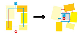
Effective solution for exploring a variety of exhibitions, workshops and entertaining zones placed on 4 levels around central core with logical sequencing of different functions – marshaling level, civic l., creative l. and finally exhibition level.
2
Comparison between typical circulation and Hub-and-spoke in REX proposal
Snøhetta
Excellent solution to explore all public spaces on one level.
1
Steven Holl
Easy to explore each level separately but there are functional difficulties to use this building as a whole, because of intercrossing so many functions and because of lack of boundaries between them, for example restaurant and creative learning on the 3th level.
4
Sutherland Hussey Architects
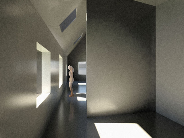
This is the most complicated proposal in terms of functional using therefore could be difficulties to explore all public spaces without confusions. I suppose that main causes are: a lack of core, variety of space height in one level and a lot of different staircases and their position.
7 (!) staircases in proposal of Sutherland Hussey Architects
B. Eating /drinking area
1. Delugan Meissl
Far way to the eating/drinking area – impressive path of steps and ramps climbs to the 2nd level ('brasserie') and 3rd level (restaurant). Unfortunately this proposal has not outside recreation area, including some outdoor part of café. Just gigantic stairs. It is big minus for so important public building. Location of wine bar – accidental. In section has been seen some stairs to outside terrace, but in plan I do not find this info.
6
2. Kengo Kuma & Associates
Very good location of restaurant and bar&café on different floors with different outer areas for enjoying different views. Restaurant has 2 entrances (quite far way inside and separate entrance from outside) what makes it more independent and exclusive. The best proposal from recreation point of view.
1
The signature restaurant with view to river Tay in Kenzo Kuma & Asoc. proposal
3. REX
Good location of restaurant on ground level with logic place of entrance, best views (both to the South and to the West) and with large outer area. More democratic café/ brassiere placed on 1st floor with view to the river. Ibidem near attractive counter around a void to restaurant on ground floor.
2
4. Snøhetta
Logic locations of eating/drinking areas. The most democratic brasserie situated in the centre of building on gallery level beside main hall - by the way to all directions. Bar is deepened with counter along glazing with view to the South. Restaurant is located on main – entrance level with terrace. Shortage – location of restaurant on south side without the view to the city and romantic sunset.
4
5. Steven Holl
Effective places for eating/drinking areas with impressive views to the city from 23m and 40m heights. Minus – location of restaurant below traffic zone and probable windy conditions on open terraces. Attractive floating artificial island with summer café.
3
6. Sutherland Hussey Architects
Good idea to locate eating/drinking area separately from bustle in foyer with framed views to both city and Newport over river. But fact that it is placed between staircase on one side and passage on another makes it quite dark and feeling of Dundee's industrial past is guaranteed.
5
C. External appearance/external space
1. Delugan Meissl
This proposal put emphasis on sculptural pomposity not on appearance. See also: B. Eating /drinking area. Not distinguish between public space and delivery access. External space without any substance - elements of environmental design.
5
2. Kengo Kuma & Associates.
Very good external appearance with spacious recreational area with various various elements of environmental design. Interesting access of supply – bridge over pool.
3
Saturated recreational space of Kenzo Kumas's proposal
3. REX
Good external appearance that is solved into tight conformity with public space of surrounding waterfront. It is not only footbridge to design centre but wholesome public space with various elements of environmental design. Minus - there is no separation between public space and delivery access.
4
Relationship between V&A public space and Waterfront Masterplan in REX proposal
4. Snøhetta
Excellent external appearance that is exciting event from the beginning of pathway. Intelligent solution of delivery. Will it work when building will be built?
1
Schemes of connections and accesses in Snøhetta proposal
5. Steven Holl
External appearance is solved really like footbridge to ship or airport gate. Fascinating and frightening. This building is not for disabled persons.
6
Unuseful for disabled persons and supply footbridge in Steven Holl's proposal
Sutherland Hussey Architects
Good solution of external appearance – promenade with useful ramps for disabled persons in wheelchairs. Good solution for delivery access – separate under foot way.
2
D. Sustainability
1. Delugan Meissl
Miserable fact – I could not find any feature of sustainable solutions used in this proposal. For instance, there is not daylight using for galleries, just skylight in atrium.
6
2. Kengo Kuma & Associates.
This proposal shows some good sustainable solutions: Its operate with natural ventilation through gaps between concrete elements and daylight diffusion through skylights – sidelights for galleries. Still, external construction are shown very thin. Consequently, there will be big thermal loses. Proposal seems very expensive, too.
5
Very thin layer of roof construction in Kengo Kuma's proposal
3. REX
The best proposal regarding to sustainability. Well considered solutions of daylight insolation and natural ventilation for all program areas, solar and rainwater collecting, economic use of area and, I hope effective solutions for reducing thermal loads. 1
Conspicuous scheme of sustainable approach in REX proposal
4. Snøhetta
Very sustainable proposal with solutions of taking energy directly from tidal movement of the Tay (seems unbelievable), effective daylight using through out glass outer façade and through holes (likewise shark gills) in the roof. Blinding of glass skin could be problematic for drivers and neighbours. Economic using of inner space.
2
Daylight holes in form of shark gills in Snøhetta proposal.
5. Steven Holl
In proposal has been seen a lot of sustainable solutions, like using local materials, using geothermal energy for heating and cooling, river propelled turbines and solar panels on the roof for electricity, daylight control etc. However, building has energy inefficient form – big outer surface to relatively small useful area.
3
Variety of sustainable solutions in Steven Holl's proposal
6. Sutherland Hussey Architects
There are some good sustainable solutions, like effective daylight using for galleries and double façade of cast glass lantern that theoretically could reduce thermal loads. However there is nothing about air changing inside of the building in cl. natural ventilation.
4
E. Visual aspect
1. Delugan Meissl
Visual quality of this proposal is in his airy fluttering. Supporting part of the building is significantly smaller then rest huge mass of artificial 'stone'. It makes feeling of non interrupted horizontal line. But it is too monumental and seems more concert hall than design centre.
4
Significant effect of non interrupted horizontal line in Delugan Meissl proposal
2. Kengo Kuma & Associates.
Strong concept of 'open public hall' sympathise to me, but its not corresponding to its main function – design centre. It is too big for local scale.
6
3. REX
This proposal is very majestic, like stormy sea. Concept of Bluebell – convincing. The most impressive is his tectonic – coherent construction what makes form of the building modest and effective simultaneously. It pays attention but not screaming.
1
Effective visual language of REX proposal
4. Snøhetta
Design of this proposal is totally 21st century organic architecture. It reflecting future design. It is very delicate to environment and fit in it. It really looks like design laboratory - floating laboratory. Unfortunately this proposal has not visual local mark qualities. Shining with shimmering reflected light is not enough.
2
5. Steven Holl
This is opposite proposal to Snohetta. Its scale is enormous. Its proportions make it unreal. It embodies big ambitions. Maybe it is something what need to ambition city? Impressive is night visualisation with city in background. New building has good relationships with urban silhouette of the city.
3
V&A and urban silhouette of the city in Steven Holl proposal
6. Sutherland Hussey Architects
Visual image is created in traditions of constructivism. Building looks very industrial, massive and complicated. In the same time there is good contrast between robust lower part and airy and transparent upper part. Red painted internal surface of 'grotto' gives life to this building. It is very local building with its rhythm of piles.
5
Significant dark 'grotto' in Sutherland Hussey Architects's proposal
Results: sum of all marks
Delugan Meissl 24
Kengo Kuma & Associates 20
REX 10
Snøhetta 10
Steven Holl 19
Sutherland Hussey Architects 22
As result, my sympathies are divided between REX and Snøhetta. In my opinion both proposals are embodied qualities of responsible, sustainable, intelligent and up to date architecture. They are clear and coherent in terms of manner of presentation and delivering a message to an observer. Finally I vote for REX, because its design is little bit more significant and considerable than Snøhetta's.
All images taken from
http://vandaatdundee.com/your-future/


